Display Mask
The Display Mask option can be used to format strings, to add dashes, spaces, brackets, etc. The formatting is applied during display only and the underlying data is left intact for transmission between client and server. A useful list of predefined masks is provided.
The #character will output a single character from the data. Any other characters contained in the mask will be output literally. Any extra text in the data that is not mapped to the mask will be output at the end. If the data is shorter than the mask then the mask will be applied until the data is complete and no further literal mask characters will be output, except any closing brackets such as
),
], or
}.
Date Formats
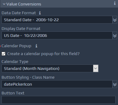
The Data Date Format option specifies the format of date fields, typically representing the the format of dates within server applications. Entered values are converted to this format prior to submission actions to the server (Requires server controllers). A list of commonly used formats is provided for convenience. You can enter your own format if required.
The Display Date Format option sets the format to be used for dates displayed on screens. A list of commonly used formats is provided for convenience. You can enter your own format if required.
Format strings operate in a similar manner to the Java SimpleDateFormat class, e.g. dd/MM/yyyy. The table below summarises the supported format string characters.
In addition, the display date format may contain the special characters # or $ to split the format across multiple input controls. The $ symbol creates a separate text box for the preceding section, whereas the # creates a drop-down list. Please see examples below, illustrating the use these options.
Table of Value Conversions available for Dates
| Field | Full Form | Short Form |
| Year | yyyy (4 digits) | yy (2 digits), y (2 or 4 digits) |
| Month | MMM (name or abbr.) | MM (2 digits), M (1 or 2 digits) |
| NNN (abbr.) | ||
| Day of Month | dd (2 digits) | d (1 or 2 digits) |
| Day of Week | EE (name) | E (abbr) |
| Hour (1-12) | hh (2 digits) | h (1 or 2 digits) |
| Hour (0-23) | HH (2 digits) | H (1 or 2 digits) |
| Hour (0-11) | KK (2 digits) | K (1 or 2 digits) |
| Hour (1-24) | kk (2 digits) | k (1 or 2 digits) |
| Minute | mm (2 digits) | m (1 or 2 digits) |
| Second | ss (2 digits) | s (1 or 2 digits) |
| AM/PM | a |
| Date Format | Example |
| yyyy-M-d | 2006-10-15 |
| dd MMMM yy | 15 October 06 |
| MM/dd/yyyy HH:mm:ss | 10/15/2006 17:23:45 |
| MM/dd/yyyy hh:mma | 10/15/2006 5:23PM |
Calendar Popup
This option can be used for date or time fields. If the checkbox is ticked, a calendar icon will be provided to enable the selection of dates via a popup calendar. Depending on the specified Display format, the calendar popup will allow selection of date, date & time, or just time values.
The Calendar Type list shows the different selection and display methods for the calendar. These options include the ability to navigate monthly or yearly, and allow for the entry of values representing the year. The year and month selection drop-downsoption is useful for Date of Birth type controls. It provides a list of 100 years backwards. It is possible to specify data constraints for Date fields using Event processing to set date range constraints. E.g. Can't select a date forward from today. Please see sections on custom scripts for more information. The Button Styling option allows a CSS class name to be specified for the calendar display button, which may display a calendar icon for example. The
datePickerIconclass name is available in most WebMaker themes. The Button Text option enables the entry of caption text, which can be used instead for the calendar popup button. Table of Frequently Used Calendar Button Styles
| Class Name | Notes on Use |
datePickerIcon |
Defines the calendar image, which can be used as the link to popup a calendar for date selection. |
timePickerIcon |
Defines an image of a clock or similar, for use against fields that only permit time selection. |
String Conversions
The Data Case Conversion option sets the case format required for the data on the server for string fields. Any values entered on screen are converted to this format on submission (Requires server controllers). The options are Preserve,
Lower,
Upper,
Titleand
Sentence. Preserve leaves the case exactly the same, Title capitalises the first letter of each word, and Sentence capitalises the first letter of the first word. Lower and Upper options convert the whole string to lowercase and uppercase respectively. The Display Case Conversion options are similar to the Data Case Conversion options, but apply to the data being displayed on client devices rather than server data. The Data Whitespace Conversion option provides control over the treatment of whitespace (blanks) entered for string values. The values are
Preserve, which leaves the data as entered,
Collapse, which removes whitespace from the beginning and end of the string and then shrinks any group of whitespace characters to a single space, and finally Remove, which removes all whitespace from the entered string.